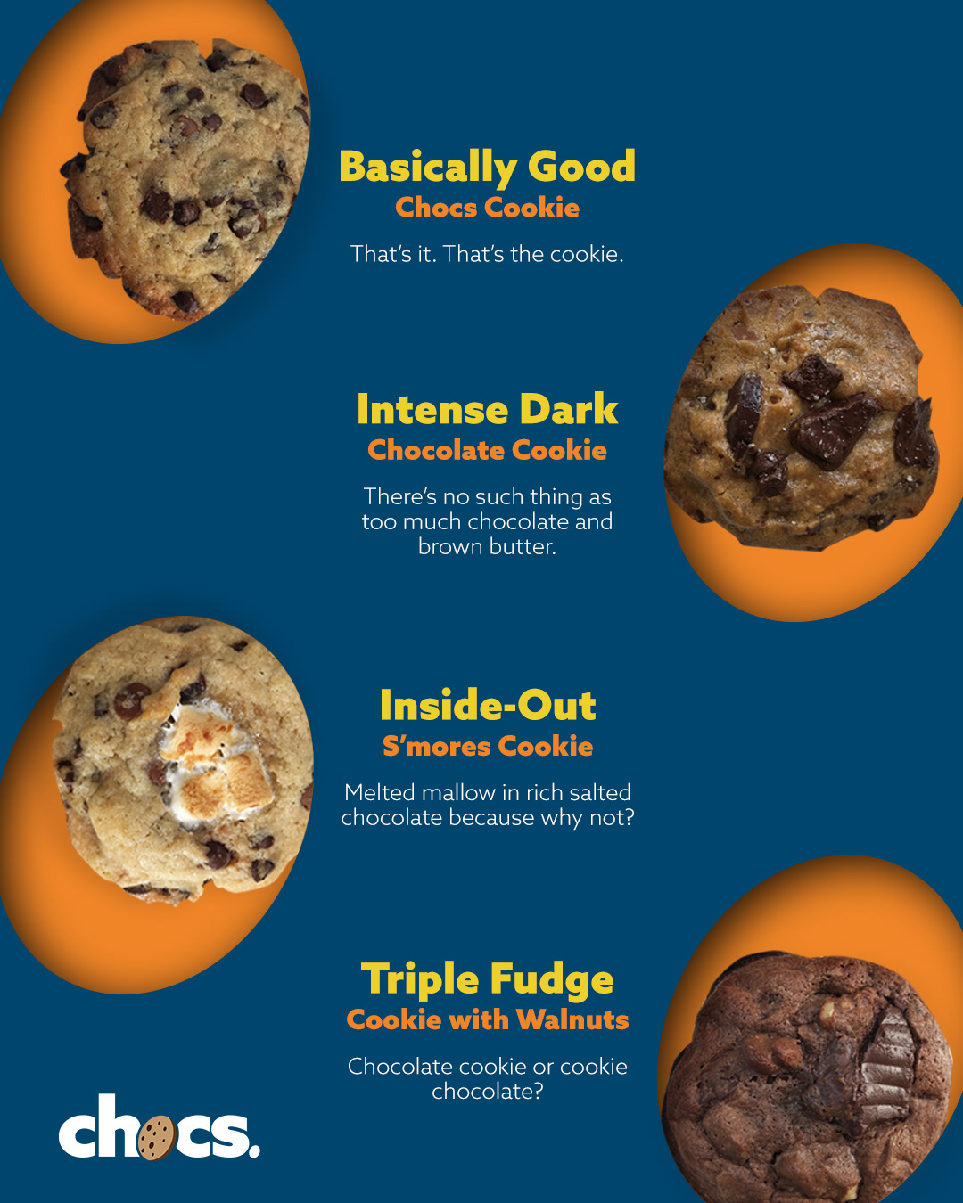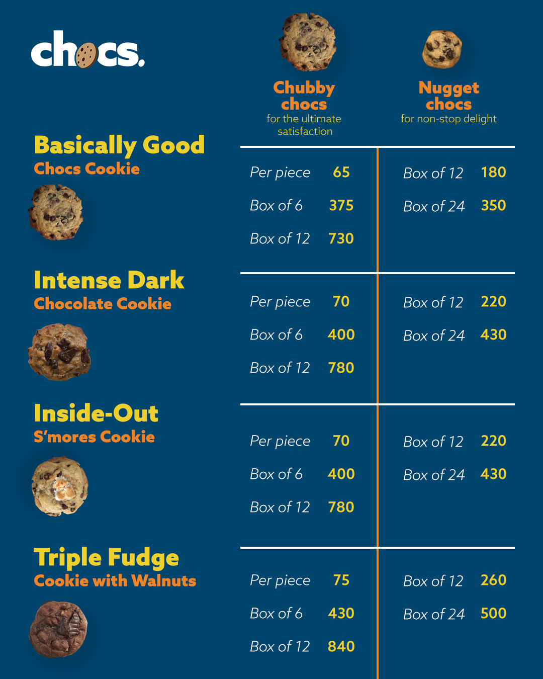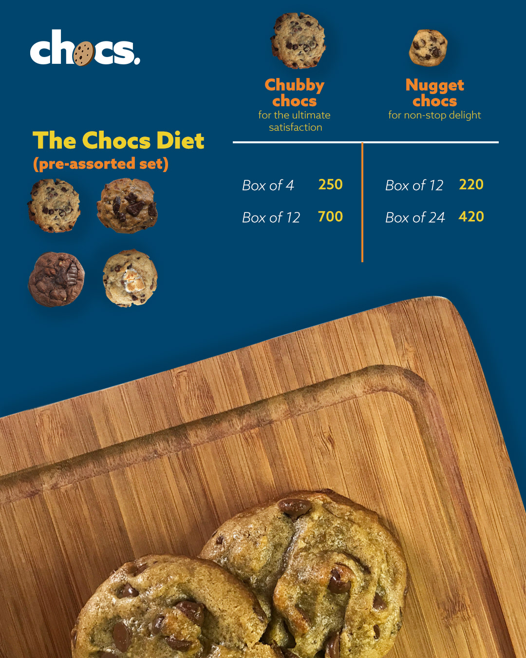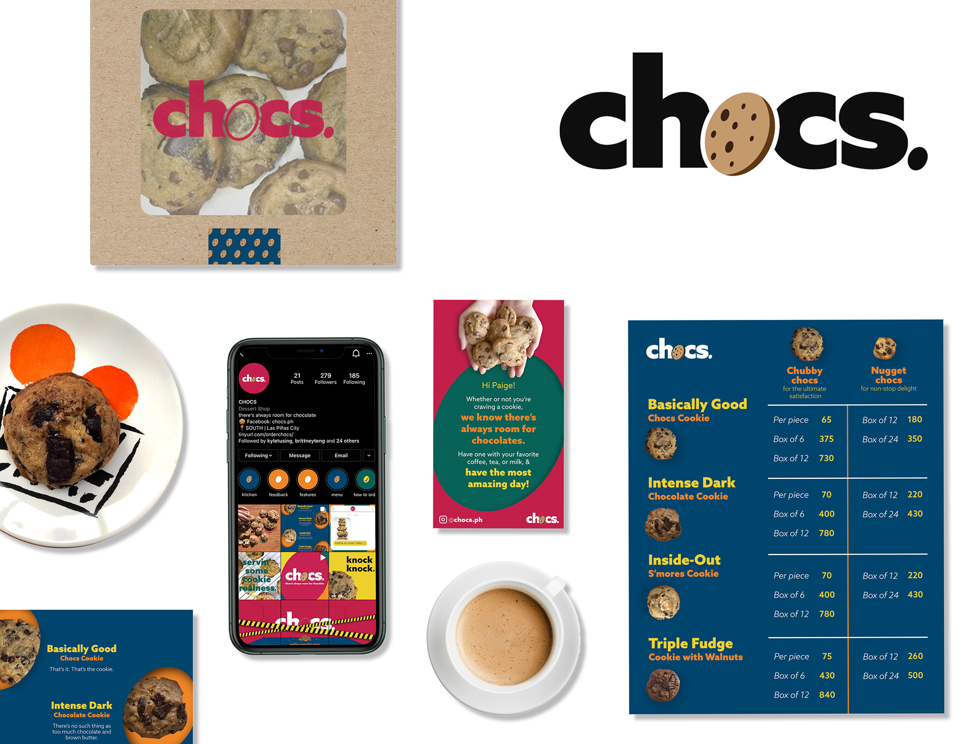
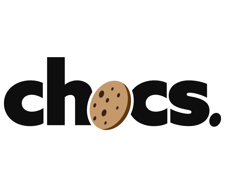
Not your ordinary dessert, chocs brings the color and quirk amidst the beiges & browns of cookies, proving that there’s always room for chocolate!

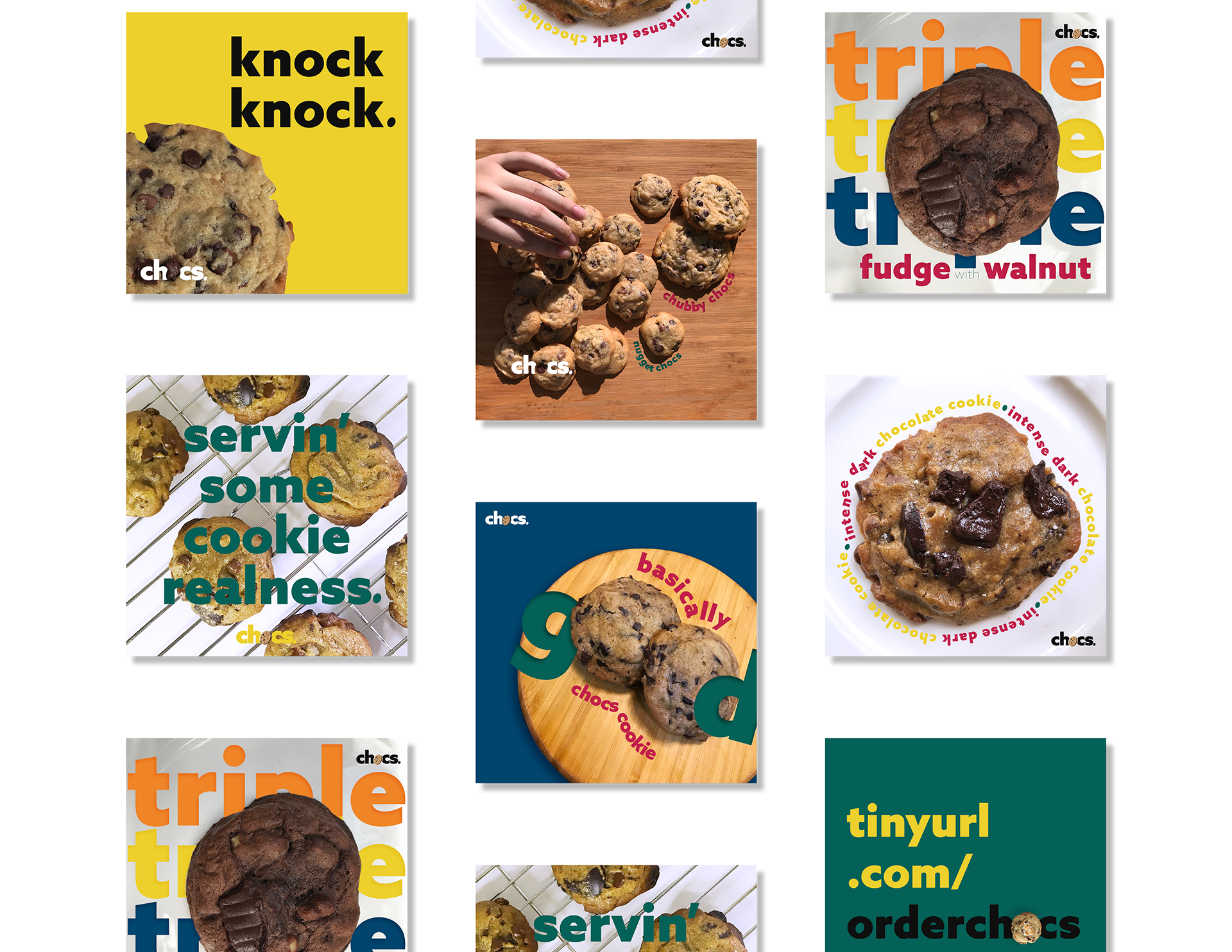
chocs defies the branding norm with a 5-brightly colored palette. Paired with a strong type, the challenge was to playfully balance the bold with the simple.
But it also had to be iconic. With cookies for O’s and tilted ovals, the brand can now have a memorable shape of their own.
Spot all of the oval icons!

With the tagline "making room for more," chocs' social media teaser starts off with the logo in an empty room with nothing but cookie crumbs.
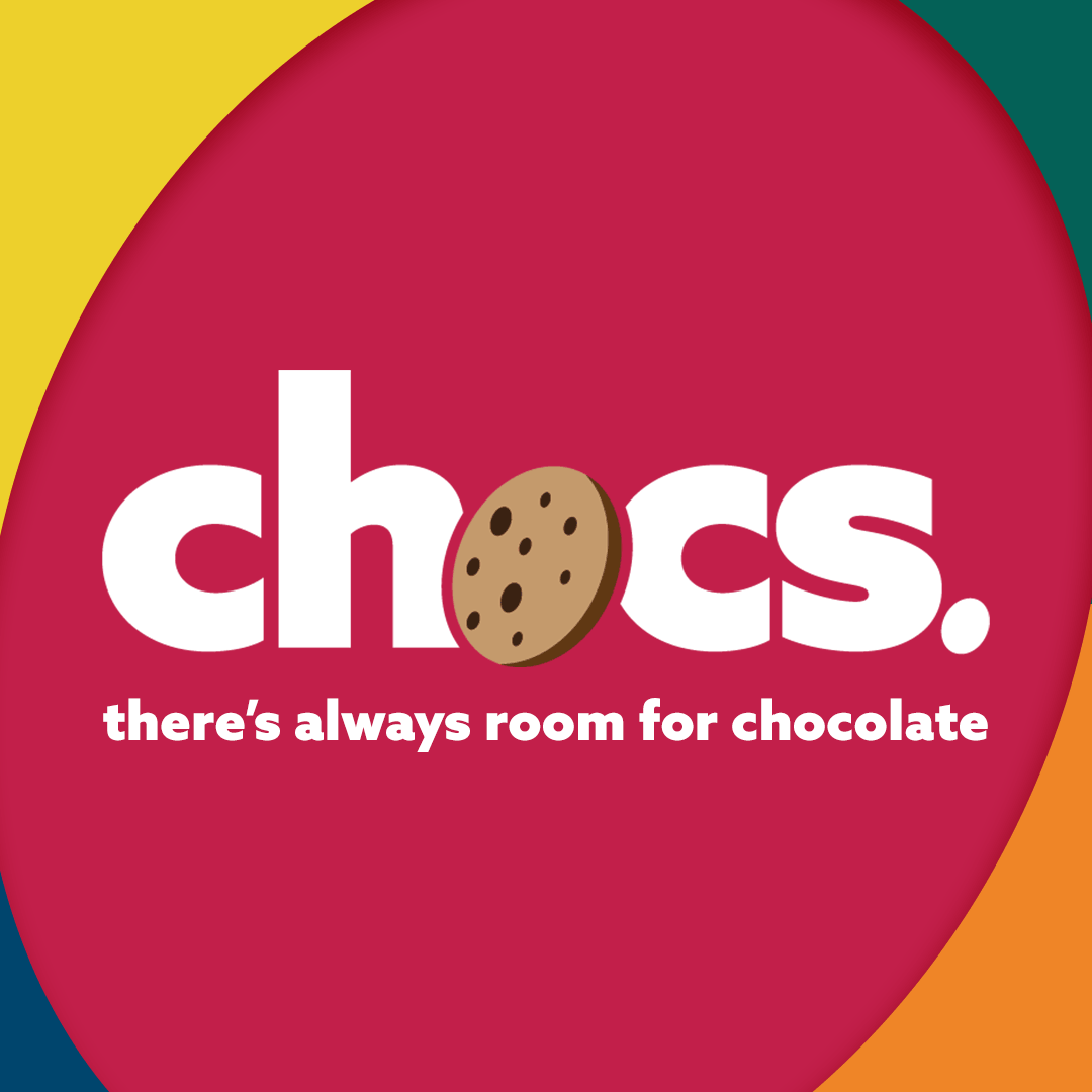
On its official social media launch, the logo is now complete with its cookie center that is happily munched away proving that there's always room for more!